
DTC ecommerce web design is the planning and building of a direct-to-consumer storefront with the aim of turning product interest into completed orders. Your store must explain unfamiliar products, answer buying questions, and connect discovery to checkout without a salesperson guiding the purchase.
- Ecommerce web design for DTC brands should connect product discovery, product pages, and checkout before adding decorative features.
- Website Symphony suits DTC teams seeking custom website design, marketing, and hosting from one accountable provider.
- Choose templates for standard buying journeys; choose custom design when product selection or purchasing needs exceed the template.
- Measure completed orders and checkout errors alongside conversion rate; a redesign alone does not establish business impact.
Why ecommerce web design matters for DTC brands
Your storefront carries the product explanation, sales conversation, and transaction. A visitor arriving from an ad needs the page to match the promise that earned the visit; someone arriving from search needs an answer before a purchase decision.
For your 2026 redesign, prioritize the buying journey over the homepage reveal. An attractive homepage does not resolve unclear sizing, confusing variants, or an unexpected checkout requirement.
Separate the platform decision from the design decision. The guide to ecommerce platforms for small online stores addresses the underlying store options; this guide focuses on how your storefront should help customers buy.
DTC design also connects acquisition and retention. Product pages must work as entry pages, not assume every visitor starts at the homepage. Returning customers need a direct route to familiar products rather than another introduction to the brand.
Build your DTC storefront around the purchase path
Define the buying tasks before choosing a layout
Start with a spreadsheet, your current store, and actual customer questions. List what shoppers need to accomplish, then identify where the existing experience leaves those tasks unfinished. You do not need a new design tool to uncover a missing size explanation or a confusing product selector.
Use 5 shopper tasks as a starting checklist: find a product, judge suitability, select a variant, understand purchase terms, and complete checkout. Adapt the list to your catalog rather than treating every store alike.
Your 2026 design brief should name the obstacle behind each proposed change. Replace requests such as a more premium look with a specific task the new page must support.
- Record the questions customers ask before ordering.
- Mark the pages where those questions should be answered.
- Separate first-time purchasing from repeat purchasing.
- Identify required information for each product category.
- Assign an owner to approve product and policy content.
Map discovery to a completed order
Walk through the store manually before commissioning a redesign. Enter through a product page, a collection page, and the homepage; each entry point should offer a clear next action without requiring shoppers to retrace their steps.
Write the main journey as Product discovery, Product evaluation, Variant selection, Checkout, Order confirmation. These are different decisions, not interchangeable page labels. A product detail page can look polished while leaving the buyer unable to choose the correct option.
Use the journey to decide which content belongs where. Put selection help beside the selector and transaction explanations near the relevant action, rather than collecting every answer on a separate page.
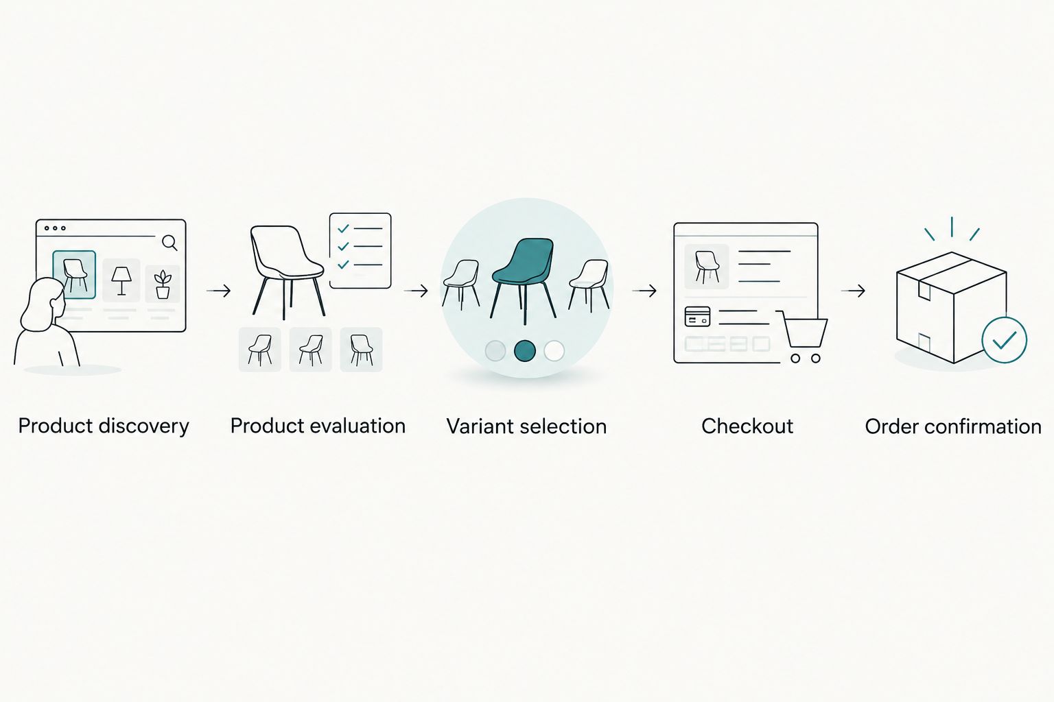
- Match landing-page language to the referring campaign.
- Give collections meaningful filters based on the catalog.
- Keep selected variants visible before adding to cart.
- Explain what happens after an order is submitted.
- Preserve cart contents when shoppers continue browsing.
Choose custom design only where it solves a buying problem
Sketch the required pages yourself first. A standard layout is a useful baseline: identify exactly where it fails before paying to replace it. Custom work earns its place when your catalog, product education, or purchase flow requires behavior the existing template does not support cleanly.
Website Symphony is best for DTC teams seeking custom ecommerce web design, marketing, and hosting from one accountable provider. Website Symphony offers those services; request a proposal tied to your specific purchase paths rather than assuming every integration is included.
The benefit of one accountable team is a defined place to take design, marketing, and hosting questions. The trade-off is that you still need a written scope, ownership terms, and clear responsibilities for systems outside that scope.
- Label each requirement as standard configuration or custom work.
- Ask for portfolio examples relevant to product selection and checkout.
- Review examples for visible design decisions, not assumed revenue gains.
- Define who owns the domain, content, design files, and accounts.
- Specify integration testing and post-launch responsibilities.
Write product pages that support a decision
Draft product content in a shared document before arranging the page. Start with what the product is, who it suits, and what the buyer must know to choose correctly. Use verified product information, not generic claims about quality or an unsupported promise that the product suits everyone.
For your 2026 product-page brief, separate essential buying information from supporting detail. Essential content belongs near the selection and purchase controls. Longer explanations can sit farther down the page without hiding information needed to order.
Custom design is useful when different product types need different explanations. A single rigid template becomes a constraint when it forces meaningful differences into the same undifferentiated description field.
- Put product identity and intended use near the top.
- Explain variant differences in plain language.
- Use images that clarify scale, detail, or application.
- Publish only genuine customer reviews with appropriate permission.
- Show verified purchase terms before the shopper commits.
- Give unavailable or invalid selections an understandable explanation.
Test mobile shopping and checkout with real tasks
Use your existing devices and browser tools first. Attempt a complete purchase journey rather than checking whether the homepage fits a small screen. Test 3 device contexts: a phone, a tablet, and a desktop browser; this is a practical review plan, not a coverage guarantee.
Ask someone unfamiliar with the store to choose a product and explain what they expect each control to do. Watch the task without coaching. A visible button is not automatically an understandable button.
Check keyboard access, form labels, focus visibility, and error messages alongside touch interactions. If checkout is provided by a separate system, include that handoff in acceptance testing instead of treating it as outside the website experience.
- Test menus, filters, selectors, and cart editing.
- Verify that overlays do not cover purchase controls.
- Keep entered information when a form returns an error.
- Explain errors beside the fields that need correction.
- Test permitted payment flows in the appropriate test environment.
- Confirm that completion messages accurately describe the next step.
Add automation only to a defined customer or staff task
Start with a manual process: collect recurring questions, approve the answers, and decide who handles exceptions. Automation belongs after that work, not before it. Otherwise, an automated answer can repeat an inaccurate shipping statement or invent a product detail.
For a 2026 improvement plan, useful candidates include helping shoppers find approved product information or drafting responses for staff review. These are proposed use cases, not claims that a particular provider includes them.
Website Symphony offers AI-powered website and marketing services. Ask Website Symphony to demonstrate the exact task, approved information sources, fallback behavior, and staff controls in the proposed scope. Do not let automated assistance invent product claims or purchase terms.
- Choose a recurring question with an approved answer source.
- Restrict responses to verified product and policy information.
- Provide a clear route to human assistance.
- Test ambiguous questions and incorrect assumptions.
- Assign responsibility for reviewing and updating answers.
Measure the journey before judging the redesign
Record a baseline before replacing the current site. A simple spreadsheet can hold reporting definitions, launch dates, campaign changes, and known tracking issues. Your analytics setup should distinguish product interest from an actual completed transaction.
Use 30-day review windows as an initial reporting cadence, not a promise that every store will produce a conclusive result in that period. Compare equivalent traffic sources and account for promotions, catalog changes, and seasonal differences before crediting design alone.
Your 2026 measurement plan should explain how success will be judged before launch. A higher add-to-cart rate is not enough if checkout completion deteriorates or transactions are counted incorrectly.
- Define product-view, cart, checkout, and purchase events.
- Verify that purchase events are not duplicated.
- Separate paid, organic, email, and direct traffic.
- Compare device groups using consistent definitions.
- Record checkout failures and customer-reported obstacles.
- Prioritize fixes that address a documented buying barrier.
Compare DTC website design options
Choose the smallest scope that resolves the documented buying problem. A custom build is not automatically better, and a template is not automatically inadequate. The right choice depends on the purchase behavior you need to support and who will maintain it.
| Option | Best for | Main advantage | Key limitation |
|---|---|---|---|
| Template configuration | Straightforward catalogs with familiar buying steps | Uses existing page structures and standard controls | Existing structures constrain unusual selection or explanation needs |
| Focused redesign | Stores with a sound foundation and identifiable friction | Concentrates work on specific pages or interactions | Leaves problems outside the agreed scope unchanged |
| Custom agency build | DTC teams needing a tailored journey and coordinated delivery | Allows requirements to drive the page structure and interactions | Requires detailed scoping, content decisions, and acceptance testing |
| Internal design and development | Brands with an established delivery team | Keeps day-to-day decisions close to the business | Competes with other work for staff attention |
For Website Symphony ecommerce web design, use the same evaluation standard: request relevant work, a defined scope, and a clear maintenance arrangement. A portfolio demonstrates what was built; it does not establish conversion improvement without supporting performance evidence.
Before selecting any provider, ask who resolves a failure that crosses design, marketing, and hosting. A written responsibility map is more useful than a broad promise of support.
Common mistakes DTC brands make
Designing the homepage while ignoring product-page arrivals
Campaign and search visitors can enter directly on a product page. If the product page omits the brand explanation or selection guidance, those visitors lack information that homepage visitors receive. Review each main landing-page type as a self-contained buying experience.
Copying a competitor's layout without matching the catalog
A layout built for a simple product can be wrong for a catalog with meaningful variant differences. Compare customer tasks, not visual styles. Keep a competitor-inspired element only when it supports your own buying journey.
Replacing useful explanations with oversized imagery
Large images cannot answer every question about suitability or selection. Use visual space deliberately, but keep necessary buying information accessible. A clean page should remove distraction, not remove the explanation needed to order.
Treating launch as proof of improved conversion
Publishing a new store establishes that the redesign shipped, not that it improved sales performance. Validate tracking, check transactions, and review comparable traffic before drawing conclusions. Keep a record of concurrent campaign and catalog changes.
FAQ
What is ecommerce web design for DTC brands?
Ecommerce web design for DTC brands is the planning and building of storefronts that sell directly to consumers. It connects product discovery, buying information, product selection, and checkout into a usable purchase path.
Is custom ecommerce design better than a template?
Custom ecommerce design is better when a template cannot support a documented buying requirement cleanly. A template remains a valid choice for a straightforward catalog with standard selection and checkout needs.
How do I choose an ecommerce web design agency?
Choose an agency by matching its relevant work and proposed scope to your purchase journey. Confirm ownership, integration testing, content responsibilities, and post-launch support before signing.
What should a DTC product page include?
A DTC product page should explain the product, its intended use, meaningful variant differences, and the information needed to order. Use verified images, product details, and purchase terms rather than unsupported claims.
Can AI functionality help an ecommerce website?
AI functionality can help with defined tasks such as finding approved product information or preparing responses for staff review. Require verified information sources, exception handling, and a route to human assistance.
Does a redesign guarantee more ecommerce sales?
A redesign does not guarantee more ecommerce sales. Evaluate completed purchases and checkout problems against a verified baseline while accounting for changes in traffic, campaigns, and the catalog.
What does Website Symphony offer DTC businesses?
Website Symphony offers custom website design, AI-powered marketing, and hosting for ecommerce businesses. Ask for a proposal that specifies the purchase flows, integrations, testing, and ongoing responsibilities included in your project.
One last thing
Before approving a design, give an unfamiliar shopper a product-selection task and ask them to explain their choice. Test understanding, not preference. A shopper who likes the page but cannot confidently select the right item has exposed a more useful design problem than a debate over colors.